

Statement wall artwork is any bold art or decor that instantly becomes the focal point of a room, commanding attention and setting the tone for everything around it. The term covers everything from oversized canvases to gallery clusters, textured panels, and hand-painted murals. Interior designers call these pieces “focal point art” or “accent wall art,” though the phrase statement wall artwork captures exactly what homeowners are searching for: something that stops you in your tracks. This article walks through the most impactful examples, with sizing rules and placement tips so you can choose with confidence.
1. Examples of statement wall artwork: oversized single-piece canvases
A single oversized canvas is the most direct way to create a statement wall. One piece, one decision, immediate impact. The visual weight of a large-scale work pulls the eye across the room before you even register the furniture beneath it.
The most popular styles for this format include:
- Abstract art: Loose brushwork, bold color fields, and gestural marks read well at scale without requiring a specific subject.
- Landscapes: Panoramic scenes of mountains, coastlines, or forests give a room a sense of depth and calm.
- Bold graphic prints: High-contrast geometric or typographic works suit modern and industrial interiors.
- Portraits: A large-scale face or figure adds personality and a sense of presence that smaller art cannot replicate.
Sizing is where most homeowners go wrong. Art above a sofa should span 60 to 75 percent of the sofa’s width, hung so the center sits 57 to 60 inches from the floor. That means an 84-inch sofa calls for art between 50 and 63 inches wide. Getting this ratio right is the difference between a piece that anchors the room and one that floats awkwardly above the furniture.
The main trade-off with single-piece works is that they require a genuinely large wall. They also offer less flexibility for layering or swapping pieces over time. But the payoff is a clean, powerful aesthetic that needs no additional styling.
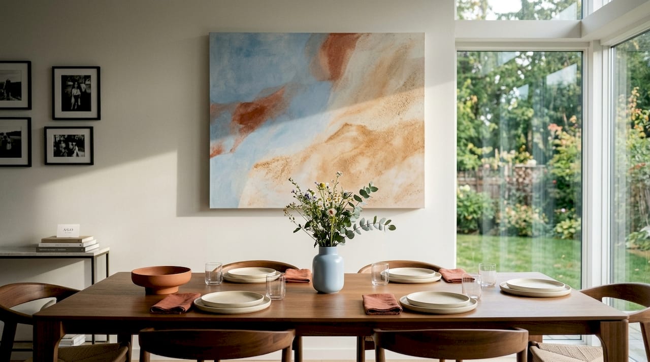
Pro Tip: Match your frame style to the room’s existing hardware and furniture legs. Thin black metal frames suit modern spaces; warm wood frames work in organic or Scandinavian interiors; ornate gold frames signal traditional or maximalist rooms. Frame choice shifts the visual weight of a piece as much as the art itself.
2. Gallery walls and salon-style clusters
A gallery wall groups multiple pieces into a curated arrangement that reads as a single statement. Salon-style walls take this further by stacking and clustering works densely from floor to ceiling, relaxing symmetry demands entirely. The result is layered, personal, and visually rich in a way no single piece can match.
Building one effectively follows a clear sequence:
- Choose an anchor piece. Start with your largest or most meaningful work. Everything else arranges around it. This reduces planning complexity and creates a natural hierarchy.
- Add medium-sized pieces. Place two or three works of similar scale on either side of the anchor, varying orientation between portrait and landscape.
- Fill with smaller pieces. Prints, photographs, ceramic plates, mirrors, and textile panels all work. Mixed objects give the wall personality beyond flat art.
- Adjust spacing. Salon walls use tight spacing of two to four inches between pieces. More space reads as a traditional grid; less space creates the dense, maximalist effect.
- Step back and photograph. Viewing the arrangement through a phone camera reveals imbalances your eye misses at close range.
The emotional impact of a gallery wall comes from the conversation between pieces, not from any single work. A travel photograph next to an abstract print next to a child’s drawing tells a story no decorator can replicate. That personal meaning is what makes gallery walls memorable rather than merely decorative.
Pro Tip: Rather than forcing perfect symmetry, use a shared center line running horizontally through the arrangement. Pieces above and below that line can vary freely in size and spacing, which creates rhythm without rigidity.
3. Textured and dimensional artworks
Textured statement walls move beyond flat imagery into physical depth. Statement walls built from sculptural or dimensional pieces add warmth and tactile interest that paint and print cannot replicate. This category covers a wide range of materials and approaches.
Common examples include:
- Wood paneling: Shiplap, board and batten, or geometric wood tile arrangements create shadow lines that shift with the light throughout the day.
- Stone and brick cladding: Thin-cut stone veneer or exposed brick sections add raw texture without structural work.
- Botanical and pressed plant arrangements: Framed herbarium prints or living moss panels bring organic texture and color.
- Mixed-media art pieces: Works that combine paint, resin, fabric, and found objects sit between sculpture and painting.
Dimensional mixed-media works like confetti geode pieces are a strong example of this category. A 25-by-20-inch geode artwork hangs like a standard canvas but catches light differently at every angle, creating a living quality that flat prints lack. That shift in visual behavior is what makes textured pieces so effective as statement art.
Place textured works on walls that receive natural side light. Raking light from a window or a directional floor lamp emphasizes depth and shadow, making the texture visible from across the room. A piece hung on a wall with only flat overhead lighting loses most of its dimensional effect.
You can also explore types of wall art by material to find dimensional options that suit your specific room conditions and budget.
4. Murals, wallpapers, and bold statement finishes
Murals and wallpapers treat the entire wall as the artwork rather than hanging pieces on it. This approach creates the most immersive statement of any format and works particularly well in rooms where furniture is minimal or where you want to establish a strong mood immediately.
Popular options in this category include:
- Botanical murals: Large-scale tropical or wildflower prints wrap a room in color and organic pattern. They work in dining rooms, bedrooms, and powder rooms where the scale feels intentional rather than overwhelming.
- Abstract murals: Gestural, color-field, or geometric designs painted directly on the wall or applied as a mural wallpaper give a custom look at a fraction of the cost of commissioned art.
- Trompe l’oeil finishes: Painted illusions of architecture, windows, or shelving add wit and depth to small rooms.
- Decorative paint techniques: Ombré gradients, color blocking, and stenciled patterns create statement walls without any hanging at all.
- Structural finishes: Board and batten, shiplap, and beadboard paneling painted in a single bold color read as both texture and color statement simultaneously.
Coordinating a mural or wallpaper with the rest of the room requires pulling one or two colors from the pattern into soft furnishings and accessories. A botanical mural with deep green and terracotta tones pairs naturally with linen cushions in those same hues. The wall becomes the anchor; everything else responds to it.
5. Multi-panel formats: diptychs and triptychs
Diptych and triptych formats split a single image or composition across two or three panels, creating the visual breadth of large-scale art without requiring one enormous piece. This makes them practical for rooms where a single oversized canvas would be difficult to source, ship, or hang.
A diptych works well above a bed or sofa where the gap between panels aligns naturally with the center of the furniture below. A triptych suits wider walls and stairwells, where the three panels can span a greater horizontal distance. The key is keeping the gap between panels consistent, typically one to three inches, so the eye reads the panels as a unified composition rather than separate works.
The subject matter that translates best to multi-panel formats includes abstract color fields, panoramic landscapes, and architectural photography. Portraits and figurative works are harder to split without the division feeling arbitrary.
6. How to size and place statement wall artwork for balance and impact
Sizing is the single factor that separates statement art from art that simply hangs on a wall. The general rule is that artwork should cover 60 to 75 percent of the available wall width or the width of the furniture it sits above. Applying this consistently across every room produces balanced, intentional results.
| Room and placement | Furniture width | Recommended art width |
|---|---|---|
| Living room, above sofa | 84 inches | 50 to 63 inches |
| Bedroom, above bed (queen) | 60 inches | 36 to 45 inches |
| Entryway, above console | 48 inches | 29 to 36 inches |
| Dining room, above buffet | 54 inches | 32 to 40 inches |
| Stairwell, vertical run | Wall height | Tall vertical or stacked series |
Hanging height matters as much as width. The standard is to center the artwork at 57 to 60 inches from the floor, which aligns with average eye level when standing. Above seating, drop the center to 48 to 54 inches so the art reads correctly from a seated position. Stairwells are the exception: follow the angle of the stair with a series of pieces, keeping consistent spacing between them.
Lighting focused on statement pieces transforms their presence. Track lighting, picture lights mounted to the frame, and floor lamps angled toward the wall all create a gallery-like effect that flat overhead lighting cannot achieve. The light source should hit the art at a 30-degree angle to minimize glare while maximizing color saturation.
Pro Tip: Before committing to a hanging position, cut paper templates to the exact dimensions of your artwork and tape them to the wall. Live with the placement for a day. You will notice things about scale and position that no measuring tape reveals.
Key takeaways
The most impactful statement wall artwork combines correct scale, intentional placement, and a format that suits both the room and your personal style.
| Point | Details |
|---|---|
| Scale is non-negotiable | Art should span 60 to 75 percent of furniture or wall width to read as a true statement. |
| Format shapes the mood | Single oversized pieces deliver clean power; gallery walls deliver personal storytelling. |
| Texture adds a dimension flat art cannot | Dimensional and mixed-media works shift visually with light, creating a living quality. |
| Lighting completes the effect | Directional lighting at 30 degrees enhances color and depth in any statement piece. |
| Personal meaning amplifies impact | A gallery wall’s strength comes from the emotional conversation between its pieces. |
Why the art you choose should make you feel something
I have spent years looking at statement walls in homes across every style and budget, and the ones that genuinely stop you in the doorway share one quality: the person who chose the art cared about it. Not because it matched the sofa. Not because an algorithm suggested it. Because it meant something to them.
The design principle behind this is real. Selecting a focal element that anchors the eye rather than adding decor indiscriminately is what separates a statement wall from a wall with a lot of stuff on it. But the practical version of that principle is simpler: buy art that you would want to look at every single day.
I have seen homeowners spend significant money on large-scale abstract prints that photograph beautifully and feel completely cold in person. I have also seen a single framed photograph from a family trip, blown up to 40 by 60 inches and hung above a bed, make a room feel more alive than any gallery-sourced piece could. Scale and presentation matter enormously. Frame and mat choice can take a modest print and make it command a room, or take an expensive piece and flatten it into wallpaper.
My honest advice: start with one piece you love, size it correctly, light it well, and resist the urge to fill the wall around it immediately. Live with it for a month. You will know whether it needs company or whether it was always enough on its own.
— DAVID
Find your next statement piece at Agostudio
Agostudio curates original artworks selected specifically because they carry emotional weight and visual presence. Every piece in the collection is chosen to work as a genuine focal point, not as background decoration. Browse the art prints collection to find oversized abstracts, bold landscapes, and modern icons sized for statement walls in living rooms, bedrooms, and entryways. If you want to rotate your statement art seasonally, the Artist Print Club delivers curated prints on a schedule, so your walls stay current without the effort of sourcing each piece yourself. For a specific starting point, the Abstract Landscape print is one of the strongest single-piece statement options in the current collection.
FAQ
What counts as statement wall artwork?
A statement wall is any wall that stands out from the rest of the room using bold art, paint, wallpaper, texture, or objects. Statement wall artwork specifically refers to the art or decor piece that creates that focal point effect.
How large should statement wall art be?
Art should span 60 to 75 percent of the width of the furniture or wall it sits above. For an 84-inch sofa, that means artwork between 50 and 63 inches wide for the best visual balance.
Can a gallery wall count as statement wall artwork?
Yes. A curated gallery wall functions as a single statement when the pieces are arranged with a clear anchor and consistent spacing. The impact comes from the conversation between pieces, not from any individual work.
What height should I hang statement art?
Hang artwork so its center sits at 57 to 60 inches from the floor when standing is the primary viewing position. Drop the center to 48 to 54 inches above seating so the art reads correctly from a seated view.
Do I need a large wall for statement artwork?
No. Textured panels, salon-style gallery clusters, and multi-panel diptychs all create strong statement effects on walls of average size. The key is correct proportion relative to the furniture, not absolute wall dimensions.