

Large wall art arrangement ideas are defined by three non-negotiable principles: scale, focal points, and consistent spacing. A blank wall is not just empty space. It is an opportunity to anchor a room, set its mood, and tell a story through art. Interior designers follow proven standards, like hanging artwork at 57–60 inches from the floor and maintaining 2–3 inch spacing between frames, because these rules produce displays that feel intentional rather than accidental. Whether you are filling a living room wall or a long hallway, the right arrangement transforms a flat surface into the most compelling feature in the room.
1. Large wall art arrangement ideas: start with the right coverage
The single most common mistake in decorating large walls is choosing art that is too small. Artwork for large walls should cover 60%–75% of the available wall or furniture width to feel balanced and intentional.
A standard sofa runs 84–96 inches wide. That means your art arrangement should span roughly 56–72 inches across. A single 24-inch canvas above an 84-inch sofa will look like a postage stamp. The art does not just look small. It makes the furniture look wrong too.
- Target two-thirds of furniture width as your minimum coverage
- For open walls with no furniture, aim for 60% of total wall width
- Use multiple pieces grouped together to hit the coverage target if one large canvas is not available
Pro Tip: Measure your furniture width before you shop for art. Write the number down and carry it with you. It is the single most useful number in any wall art decision.
Large walls also benefit from fewer, larger statement pieces rather than many small ones scattered across the surface. Small pieces on large walls create visual noise without visual weight.
2. How to choose the right layout style for your wall
The four main layout styles for wall art displays are grid, salon, asymmetric cluster, and linear row. Each suits a different room personality and wall size.
| Layout Style | Best For | Visual Effect | Difficulty |
|---|---|---|---|
| Grid | Modern, minimal rooms | Clean, structured, calm | Low |
| Salon/eclectic | Bold, layered interiors | Dramatic, high-impact | Medium |
| Asymmetric cluster | Warm, casual living spaces | Inviting, personal | Medium |
| Linear row | Hallways, narrow walls | Ordered, directional | Low |
The grid layout uses equal-size frames in neat rows and is the most beginner-friendly option. Salon style mixes sizes and orientations for a high-drama effect, but it requires more planning to avoid looking chaotic. The asymmetric cluster works best when anchored by one large dominant piece with smaller works radiating outward.
Stick to one layout style per wall. Mixing grid logic with salon randomness produces confusion, not character. Choose based on the room’s existing furniture and the emotional tone you want the space to carry.
For a deeper look at how these styles compare in practice, the gallery wall vs. single piece guide from Agostudio breaks down the tradeoffs clearly.
3. Spacing and placement: the numbers that matter
Consistent spacing is what separates a professional gallery wall from a random collection of frames. Frames in gallery walls should maintain 2–3 inches of spacing between each piece for a cohesive look. Spacing below 1.5 inches creates visual clutter. Spacing above 8 inches breaks the arrangement into isolated pieces that no longer read as a group.
The standard hanging height places the optical center at 57–60 inches from the floor. This is the museum standard and the most widely used guideline in residential design. Rooms with high ceilings can push toward 60 inches. Rooms with low furniture or low ceilings should stay closer to 57 inches.
- Measure 57–60 inches from the floor and mark it lightly with a pencil
- Center your arrangement around that mark, not the top of the wall
- Maintain 6–8 inches of clearance between the bottom of the art and the top of any furniture beneath it
- For standard 8-foot ceilings, leave 12–14 inches between art and ceiling for breathing room
These numbers are not arbitrary. They reflect how the human eye naturally scans a room at standing height. Art hung too high forces the eye upward and disconnects the work from the furniture and people below it.
4. How to select and use an anchor piece
Every strong wall art display needs an anchor piece. The anchor is the largest, most visually dominant work in the arrangement. It provides a center of gravity that guides the eye and prevents the arrangement from feeling scattered.
The anchor piece should be 50% larger than the next biggest frame in the arrangement. That size difference is what gives it authority. Without it, the eye bounces between equally weighted pieces and never settles. An anchor piece that is only slightly larger than its neighbors does not function as an anchor at all.
Place the anchor piece first, at the optical center height. Build the rest of the arrangement outward from there. This approach applies to salon walls, asymmetric clusters, and any arrangement with five or more pieces.
Pro Tip: When choosing your anchor piece, pick the work you love most, not just the largest canvas you own. The anchor sets the emotional tone for the entire wall. It should be the piece you want people to notice first.
Mixing frame styles and sizes around one large anchor piece creates warm, inviting displays. The anchor provides structure. The surrounding pieces provide personality.
5. Mixing sizes, textures, and non-art objects
A flat arrangement of identically framed prints looks finished but rarely feels alive. Texture and dimension are what make a wall display feel personal rather than catalog-ready.
Mixing non-art objects like plants or mirrors within a gallery wall adds texture and prevents large arrangements from feeling flat or overly formal. A small trailing plant on a shelf bracket, a round mirror between two prints, or a sculptural wall piece among flat frames all add depth without competing with the art itself.
- Use the same frame finish across all pieces for a cohesive look, or mix finishes deliberately for an eclectic style
- Vary frame widths, not just sizes, to add visual interest without changing the art
- Limit non-art objects to two or three per arrangement to avoid clutter
- Round shapes, like mirrors or circular frames, break up the rigidity of rectangular prints effectively
Adding plants, mirrors, or sculptural wall decor within large gallery walls adds important texture that flat prints alone cannot provide. The goal is a wall that rewards a second look, not just a first glance.
For ideas on how statement pieces work within larger arrangements, Agostudio’s guide on statement wall artwork shows real examples across different room types.
6. How to plan and install your arrangement without mistakes
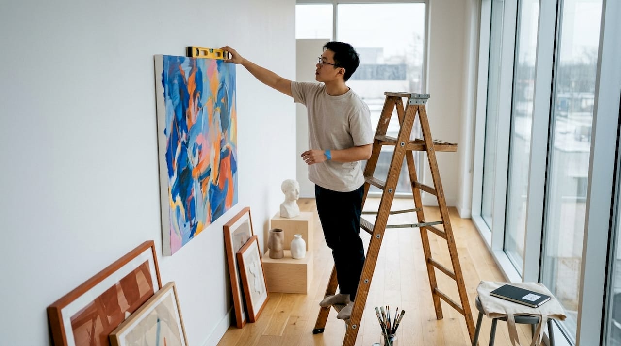
The biggest mistake in arranging gallery walls is buying frames without pre-planning the entire arrangement footprint. Hanging art without a plan produces uneven spacing, off-center groupings, and walls full of unnecessary nail holes.
Professionals use a simple two-step process before touching a single nail.
- Lay all pieces on the floor in the arrangement you want. Photograph it from above. Adjust until the spacing and balance feel right.
- Cut paper templates to the exact size of each frame. Tape them to the wall with painter’s tape. Step back and live with the layout for a day before committing.
This process, using paper templates taped to walls, lets you rearrange multiple times without any damage. Once the templates are approved, mark the hanging hardware positions directly through the paper, then remove the templates and hang.
Start hanging from the anchor piece and work outward. Do not start from a corner or an edge. Starting from the center keeps the arrangement balanced as you add pieces. Check spacing with a tape measure after every second frame, not just at the end.
Most balanced gallery walls contain 5–12 pieces. Fewer than five pieces reads as a vignette rather than a gallery. More than twelve pieces on a standard wall risks visual overload. Adjust the count based on your wall width and the size of each piece.
Key takeaways
The most effective large wall art arrangements combine correct coverage, a dominant anchor piece, and consistent 2–3 inch spacing to create displays that feel intentional and cohesive.
| Point | Details |
|---|---|
| Coverage matters most | Art should cover 60%–75% of wall or furniture width to avoid looking lost. |
| Anchor piece is non-negotiable | The anchor should be 50% larger than the next biggest frame to stabilize the arrangement. |
| Hang at eye level | Place the optical center at 57–60 inches from the floor for professional results. |
| Plan before you hang | Use floor layouts and paper templates to finalize spacing before using any nails. |
| Add texture intentionally | Mirrors, plants, and varied frame widths prevent flat, catalog-style displays. |
What I have learned from years of watching walls go wrong
The most common thing I see in homes with beautiful furniture and forgettable walls is not bad taste. It is a lack of planning. People buy art they love, hang it at whatever height feels right in the moment, and wonder why the room still feels incomplete.
The 57-inch optical center rule changed how I think about placement. Before I understood it, I hung art too high, almost every time. High art disconnects from the room. It floats. It does not belong to the furniture or the people in the space. Once you hang at true eye level, the room pulls together in a way that is hard to explain but immediately obvious.
The other thing I have come to believe strongly: gallery walls should evolve. The best ones I have seen were not installed in a single afternoon. They grew over months and years as the homeowner found new pieces, swapped out others, and refined the arrangement. Treat your wall as a living collection, not a finished project. Leave intentional gaps. Buy art you love before you know exactly where it will go.
The emotional impact of well-arranged art is real. Agostudio’s perspective on why artwork transforms spaces captures this well. A wall that is planned, proportioned, and personal does not just look good. It changes how a room feels to be in.
— DAVID
Art prints and collections worth building your wall around
Agostudio curates original artworks selected for their emotional resonance and visual weight, exactly the qualities that make strong anchor pieces and gallery wall companions.
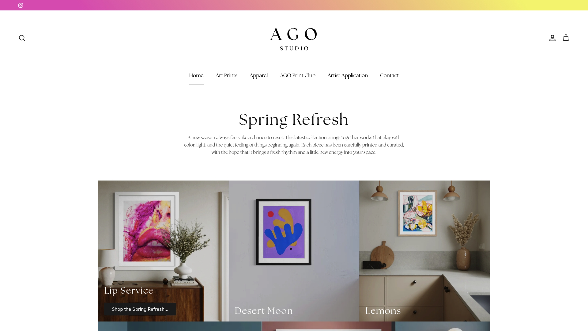
The art prints collection at Agostudio includes large canvas options suited for statement walls and multi-piece arrangements alike. For homeowners who want to refresh their walls regularly with new work, the Artist Print Club delivers exclusive prints from real artists on a rotating basis. The Abstract Landscape print is a strong anchor candidate, with the scale and visual weight to hold a large wall arrangement together. Each piece is chosen to feel meaningful, not just decorative.
FAQ
What size art works best for a large wall?
Art should cover 60%–75% of the wall or furniture width beneath it. For an 84-inch sofa, that means your arrangement should span at least 56 inches across.
How high should large wall art be hung?
The optical center of the arrangement should sit 57–60 inches from the floor. This is the museum standard and works in most residential rooms.
How many pieces should a gallery wall have?
Most balanced gallery walls contain 5–12 pieces. Fewer than five reads as a vignette. Adjust the count based on wall width and individual frame sizes.
What spacing should I use between frames?
Maintain 2–3 inches between frames for a cohesive gallery look. Spacing below 1.5 inches creates clutter, and spacing above 8 inches breaks the visual grouping.
How do I avoid mistakes when hanging a gallery wall?
Lay all pieces on the floor first to test the composition, then use paper templates taped to the wall to preview placement before committing with nails.