

Artwork transforms spaces by directly reshaping mood, spatial perception, and personal identity in ways no other decor element can replicate. A painting does not simply fill a wall. It changes how a room feels by triggering emotional responses through color, scale, and subject matter. Color psychology, proportion, and placement are the core mechanisms behind this transformation. Agostudio was built around exactly this idea: that original art, chosen with intention, turns a house into a home that reflects who you are.
Why artwork transforms spaces at a psychological level
Art’s power over a room starts in the brain. Human brains seek focal points in any space, and without one, a room feels unfinished or scattered. Artwork provides that anchor. It gives the eye a place to land and the mind a cue about what this room is for and how it should feel.
The field of environmental psychology, developed in part through Henri Lefebvre’s spatial theory, describes space as something we perceive, conceive, and live through simultaneously. Art operates at all three levels. It shapes your first impression of a room, informs how you mentally categorize it, and affects how you feel while spending time in it. That triple function is what separates art from a throw pillow or a side table.

Color is the most direct mechanism. Cool tones like blue and green visually recede, making walls feel farther away and rooms feel larger. Warm tones like red, orange, and deep yellow advance visually, pulling walls closer and adding energy to social spaces. A single large canvas can shift the perceived size of a room without moving a single piece of furniture.
Subject matter adds another layer. A seascape creates calm. An abstract with sharp angles creates tension and energy. A portrait invites intimacy. These are not accidental effects. They are the result of how the brain processes imagery and assigns emotional meaning to visual information.
How color and imagery shape the ambiance of any room
Color in artwork does not operate in isolation. It interacts with your walls, furniture, and textiles to create a unified or fragmented visual experience. When the colors in a painting echo the tones in your sofa or rug, the room reads as cohesive. When they clash without intention, the room feels restless.
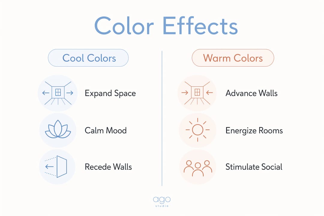
Design professionals consistently point to color interaction between art and textiles as one of the most powerful tools for spatial dynamics. The key is using varying shades rather than exact matches. A painting with three shades of blue above a navy sofa creates depth. An exact color match flattens the visual experience.
Here is how different color choices play out across common rooms:
- Living room: Warm ochres, terracottas, and deep greens create a welcoming, social energy. These tones signal comfort and conversation.
- Bedroom: Soft blues, muted greens, and pale neutrals lower visual stimulation and support rest. Agostudio’s Minimalist Flowers print is a strong example of this calming effect.
- Home office: High-contrast abstract work or nature imagery with cool tones supports focus without feeling sterile.
- Dining room: Rich, saturated colors stimulate appetite and conversation. Deep reds and warm golds have been used in restaurant design for this reason for decades.
Pro Tip: Pick one dominant color from your artwork and repeat it in one small accent in the room, such as a cushion or vase. This creates visual continuity without making the space feel overly coordinated.
Art also affects sensory perception beyond the visual. Artwork chosen with intention can make rooms feel brighter and less acoustically harsh, particularly in open-plan spaces where sound and light bounce freely.
Does scale and placement determine how much art changes a room?
Scale is where most homeowners and renters make their biggest mistakes. A small print above a large sofa does not transform anything. It shrinks. The room reads as unresolved, and the art loses all impact.
Large-scale art spanning roughly two-thirds the width of the furniture beneath it is the most effective proportion for anchoring a room. Interior designers favor oversized canvases because they create visual confidence and reduce compositional clutter. One strong piece does more work than five small ones competing for attention.
Placement follows a clear logic once you understand sightlines and zones:
- Hang at eye level. The center of a piece should sit approximately 57–60 inches from the floor. This is the standard used in most galleries and the most comfortable viewing height for standing adults.
- Anchor to furniture, not walls. Art hung too high above a sofa creates a visual gap that disconnects the two elements. Keep the bottom edge of the frame 6–8 inches above the furniture.
- Use art to define zones. In open-plan layouts, a large piece above a dining table or reading chair signals where one zone ends and another begins. This is one of the most underused tools in rental spaces where structural changes are not possible.
- Consider the gallery wall vs. single statement decision carefully. A gallery wall tells a layered story but requires planning. A single statement piece delivers immediate impact with less risk.
- Check the light source. Natural light from the left or right creates shadows and depth on textured pieces. Direct overhead light flattens most artwork. Position pieces where they catch indirect natural light when possible.
Pro Tip: Before hanging anything, cut paper templates to the exact size of your frames and tape them to the wall. Live with the arrangement for a day before committing to holes.
| Placement factor | Effect on space |
|---|---|
| Art width at 2/3 of furniture | Anchors the arrangement, creates visual balance |
| Center hung at 57–60 inches | Comfortable sightline, gallery-standard proportion |
| Art too small for wall | Room feels unresolved, art loses impact |
| Art defines open-plan zones | Creates structure without physical dividers |
| Indirect natural light on art | Enhances depth and texture in the piece |
Wall art unifies color and corrects proportions, turning a simple furniture arrangement into a cohesive environment. That is the difference between a room that looks decorated and one that feels designed.
Art vs. furniture, lighting, and textiles: what actually changes a room?
Furniture, lighting, and textiles all serve functional roles first. A sofa is for sitting. A lamp is for light. A rug defines a floor zone. These elements shape the structure of a room, but they rarely communicate who lives there or how the space should feel emotionally.
Art carries no functional obligation. Its entire job is to communicate. Artwork conveys mood and identity in ways that furniture and lighting cannot. A bookshelf tells visitors you read. A painting tells them how you see the world.
| Element | Primary role | Emotional impact | Personalization potential |
|---|---|---|---|
| Artwork | Visual and emotional expression | Direct and immediate | Very high |
| Furniture | Function and structure | Indirect, through comfort | Moderate |
| Lighting | Illumination and atmosphere | Strong but ambient | Low to moderate |
| Textiles | Texture, warmth, softness | Subtle | Moderate |
Art also integrates with existing design without requiring renovation. You can change the entire character of a room by swapping one large print. You cannot do that with a sofa. For renters especially, this makes art the most flexible and high-impact tool available.
The social dimension matters too. Art creates conversation and builds connection between people in a space. A piece that reflects a personal story or a strong aesthetic point of view invites guests to engage. Furniture rarely does that.
How to choose and position artwork for maximum impact
Start with the room’s function and your desired emotional outcome before you look at a single piece. A bedroom needs different art than a home office. Knowing what you want to feel in a room narrows your selection dramatically.
- Assess the room’s color palette first. Identify the two or three dominant colors in your existing furnishings. Choose art that contains at least one of those tones, either as a dominant or accent color.
- Match scale to the wall, not the room. A large blank wall needs a large piece or a structured grouping. A small alcove works with a single medium print. Scale to the specific surface, not the overall square footage.
- Choose subject matter that matches function. Calm, nature-based imagery suits bedrooms and reading corners. Abstract, energetic work suits creative spaces and home office environments. Figurative or narrative work suits living areas where conversation happens.
- Avoid the clutter trap. Unplanned art collections dilute impact. Cohesive groupings with a shared color, theme, or frame style tell a story. Random accumulation just adds noise.
- Use statement pieces for immediate transformation. One large, well-chosen canvas does more for a room than a dozen small prints scattered across walls. Agostudio’s Abstract Landscape is a strong example of a single piece that anchors an entire room.
- Test before you commit. Use digital mockup tools or paper templates to preview scale and placement before purchasing or hanging.
The most common mistake is buying art you love in isolation without considering how it will function in the specific room. Art that transforms a space works with the room, not just in it.
Key takeaways
Artwork transforms spaces by reshaping mood, spatial perception, and personal identity through color, scale, placement, and subject matter.
| Point | Details |
|---|---|
| Color drives mood | Cool tones expand space visually; warm tones energize social rooms. |
| Scale determines impact | Art width should span roughly two-thirds of the furniture it anchors. |
| Placement creates structure | Hang at 57–60 inches center height and use art to define zones in open-plan rooms. |
| Art outperforms other decor for personalization | Unlike furniture or lighting, art communicates identity and mood directly. |
| Intention prevents clutter | Choose art based on room function and color palette to maintain visual coherence. |
What I’ve learned about art and the rooms we actually live in
Most interior design advice treats art as the final step. You buy the sofa, paint the walls, choose the rug, and then hang something to fill the silence. That sequence gets it backwards.
Art is not a finishing touch. It is the emotional brief for the room. When you know what a piece makes you feel, you can build everything else around that feeling. The sofa, the lighting, the textiles all become supporting characters. The art sets the tone.
I have seen this play out in spaces that look expensive but feel empty. Every element is well chosen, but nothing communicates. The room has no point of view. Then one strong piece goes up, and suddenly the whole room has a reason to exist. That is not decoration. That is spatial storytelling.
Henri Lefebvre’s framework for understanding space as something perceived, conceived, and lived is not just academic theory. It describes exactly what happens when you walk into a room with a powerful piece of art on the wall. You perceive it immediately. You form a mental model of the space based on it. And you live differently in that room because of it.
The alienation that comes from monotonous, generic interiors is real. Environmental art mediates between perception and lived experience, redefining how a space feels without any structural changes. For renters who cannot paint walls or knock down partitions, that is not a small thing. It is the whole game.
Choose art that means something to you. Not because it matches the sofa. Because it says something true about who you are and how you want to feel in your own home.
— DAVID
Find artwork that actually transforms your space
Agostudio curates original art prints selected for their emotional depth and visual impact, not just their aesthetic appeal. Every piece in the collection is chosen to resonate, to anchor a room, and to reflect the person who lives there.
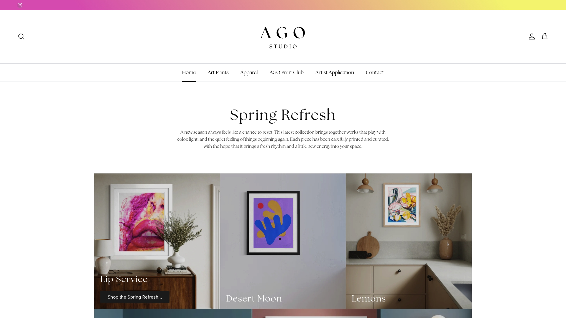
Whether you are furnishing a first apartment or refreshing a long-term home, the Agostudio art prints collection offers pieces scaled for real rooms and real walls. From calm florals for bedrooms to bold abstract work for living spaces, the range covers the full spectrum of mood and function. If you want a regular rotation of curated work, the Artist Print Club delivers new pieces on a schedule, so your spaces keep evolving.
FAQ
Why does artwork transform a room more than other decor?
Art carries no functional obligation, so its entire purpose is emotional and visual communication. Unlike furniture or lighting, a single piece can shift the mood, perceived size, and personal identity of a room immediately.
What size artwork works best for most rooms?
Art that spans roughly two-thirds the width of the furniture beneath it creates the strongest visual anchor. Pieces that are too small lose impact and make the room feel unresolved.
How does color in artwork affect how a room feels?
Cool tones like blue and green make walls recede, expanding perceived space. Warm tones like red and orange advance visually, adding energy and warmth to social rooms.
Can artwork transform a rental space without permanent changes?
Art is the most flexible transformation tool available to renters. Swapping a large print changes the entire character of a room without painting, renovating, or replacing furniture.
How do I avoid buying art that does not work in my space?
Assess your room’s dominant color palette and desired mood before selecting any piece. Unplanned art collections dilute impact; cohesive choices based on room function create a clear visual story.