

A gallery wall layout for large spaces is a curated arrangement of art pieces that covers 60%–75% of the wall area, anchored at eye level to create visual harmony across an expansive surface. Large walls are unforgiving. Too little art and the room feels empty. Too much and it feels chaotic. The sweet spot lives in proportion, spacing, and a clear anchor point. Interior designers consistently place the optical center at 57–60 inches from the floor, matching average eye level for the most comfortable viewing experience. Getting these fundamentals right before you pick up a hammer is what separates a polished display from a wall that never quite looks finished.
How to plan a gallery wall layout for large spaces
Measuring before you hang is the single most important step in art wall design for large rooms. Start by recording the exact width and height of your wall. Then sketch the space on paper or use a free digital floor plan tool to map where your arrangement will sit.
The optical center of your entire gallery arrangement should fall at 57–60 inches from the floor. That is the center of the whole grouping, not the center of each individual frame. Beginners consistently make the mistake of hanging each piece at eye level separately, which pushes the overall arrangement too high.
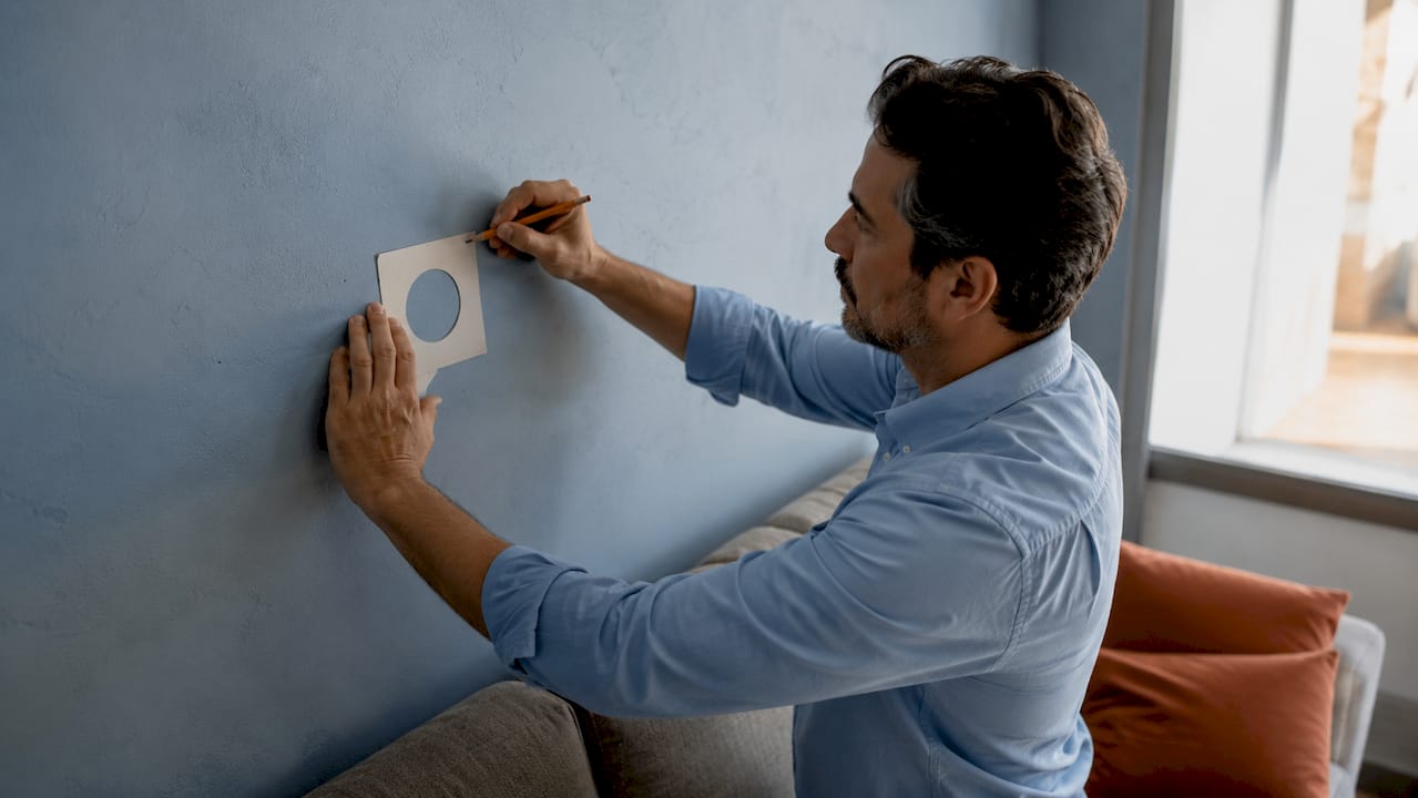
Coverage matters as much as height. Your art grouping should fill 60%–75% of the wall area to maintain visual balance without overwhelming the room. On a wall that is 12 feet wide, that means your arrangement spans roughly 7–9 feet across.
When your gallery wall sits above furniture, scale the width to the piece below it. Art or a grouping hung above a sofa should span 67%–75% of the furniture width and sit 6–8 inches above the cushion tops. A 96-inch sofa calls for an arrangement roughly 64–72 inches wide.
| Wall or furniture type | Recommended art width | Clearance above furniture | Optical center height |
|---|---|---|---|
| Sofa (96 inches) | 64–72 inches | 6–8 inches | 57–60 inches from floor |
| Console table (48 inches) | 32–36 inches | 6–8 inches | 57–60 inches from floor |
| Open large wall (12 feet) | 84–108 inches | N/A | 57–60 inches from floor |
| Dining room wall (10 feet) | 72–90 inches | N/A | 57–60 inches from floor |
Pro Tip: Tape the outline of your planned arrangement directly on the wall with painter’s tape before you buy a single frame. Living with the taped shape for a day or two tells you immediately if the scale feels right in real light and from different angles in the room.
What artwork sizes and styles work best on large walls?
Large walls demand large thinking. A single small print centered on a 10-foot wall looks like a postage stamp. The most effective large wall art groupings use either one oversized anchor piece or a collection built around a dominant focal frame.
The anchor piece concept is straightforward. Choose the largest or most visually commanding work first, place it at the center of your planned arrangement, and build outward from there. Every other piece in the grouping should relate to the anchor in scale, color, or theme. This prevents the scattered look that plagues most first attempts at arranging art on large walls.
Three layout styles dominate large space wall decor ideas:
- Grid layout: Identical or similarly sized frames arranged in uniform rows and columns. Works best in modern, minimal interiors. Requires precise measurement but delivers a clean, gallery-like result.
- Salon style: Frames of varying sizes arranged in an organic cluster, mixing orientations and shapes. Works in traditional, eclectic, or maximalist rooms. The anchor piece typically sits near the center.
- Asymmetric cluster: A looser version of salon style with intentional visual weight on one side, balanced by negative space on the other. Works well in contemporary spaces where tension and balance coexist.
Color palette unifies a gallery wall faster than any other single decision. Pieces that share one or two recurring colors read as a collection rather than a random assortment. You do not need matching frames, but consistent framing or color accents create visual rhythm and invite closer viewing.
Mixing frame types works when you commit to a finish. All black frames with varied widths feel intentional. A mix of black, gold, white, and natural wood in the same arrangement feels accidental.
Pro Tip: Cut paper templates to the exact size of each frame you plan to use. Tape them to the wall in your planned arrangement and photograph the result. The photo reveals spacing problems and proportion issues that your eye misses when you are standing directly in front of the wall.
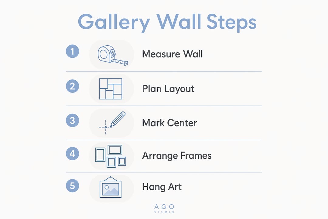
How do you hang a gallery wall step by step?
Hanging a large gallery wall is a physical process that rewards patience. Rushing the installation is the fastest way to end up with crooked frames and mismatched gaps.
- Mark your optical center. Find the midpoint of your planned arrangement horizontally and mark 57–60 inches from the floor at that point. This is your anchor.
- Hang the largest piece first. Center the anchor frame on your marked point. Every subsequent piece references this one.
- Work outward in pairs. Hang one piece to the left, then one to the right, one above, then one below. This keeps the arrangement balanced as it grows.
- Maintain 2–3 inches between frames consistently. Use a small piece of cardboard cut to 2.5 inches as a spacer. Gaps smaller than 1.5 inches feel cramped. Gaps larger than 8 inches break the grouping apart visually.
- Check level after every frame. A small bubble level takes seconds to use and prevents the creeping tilt that only becomes obvious after the whole wall is done.
- Step back frequently. Walk to the opposite side of the room after every two or three frames. Distance reveals imbalance that close-up work hides.
The most common mistake in designing gallery walls in big spaces is treating each frame as an independent object. A gallery wall is one piece of art made from many parts. Every spacing decision, every height adjustment, every frame choice either strengthens or weakens the whole. Hang it as a unit, not as a collection of individual pictures.
Above furniture, maintain 6–8 inches of clearance between the top of the cushions or surface and the bottom of the lowest frame. Less than 6 inches and the art appears to be sitting on the furniture. More than 10 inches and the two elements stop relating to each other visually.
How does color and theme create emotional impact on a gallery wall?
Color is the fastest tool for controlling how a room feels. Warm tones like terracotta create intimacy, cool tones like slate promote relaxation, and neutral palettes keep focus on the furniture and architecture rather than the art itself. Interior designers call this “emotional programming,” and it applies directly to how you select and arrange pieces on a large wall.
Art that transforms the emotional atmosphere of a space does so through a combination of color, subject matter, and scale. A large abstract in deep blues and grays reads as calm and contemplative. The same wall covered in warm ochres and burnt oranges feels energizing and social.
Key considerations for personalizing your large gallery wall:
- Theme coherence: Group pieces by subject (botanicals, cityscapes, portraits) or by mood rather than by style. Thematic groupings read as intentional even when the frames and sizes vary.
- Art type variety: Mix original paintings, photographic prints, and small three-dimensional objects like ceramic plates or woven pieces. Texture adds depth that flat prints alone cannot achieve.
- Negative space: Leave breathing room around the arrangement. A gallery wall that fills every inch of a large wall creates visual noise rather than visual interest.
- Personal narrative: The most memorable gallery walls tell a story. Pieces connected by a shared experience, place, or relationship give viewers something to engage with beyond aesthetics.
- Avoid visual clutter: Limit the number of distinct color families in the arrangement to three or fewer. More than that and the eye has nowhere to rest.
Emotionally resonant art does not require expensive originals. A well-chosen print that connects to your personal history or aesthetic carries the same emotional weight as a one-of-a-kind canvas. The selection process matters more than the price point.
One underused approach for maximizing wall space with art is the single oversized statement piece. A single work covering at least two-thirds of a large wall delivers direct design impact and anchors the room without the complexity of a multi-piece arrangement. For walls wider than 6 feet, a minimum dimension of 40 inches is recommended for the art to hold its own visually.
Key Takeaways
A successful gallery wall layout for large spaces depends on three non-negotiable principles: correct optical center height, proportional coverage, and consistent frame spacing.
| Point | Details |
|---|---|
| Anchor at eye level | Center the entire arrangement at 57–60 inches from the floor, not each individual frame. |
| Cover 60%–75% of the wall | Art that covers less than 60% of a large wall looks sparse; more than 75% feels crowded. |
| Space frames 2–3 inches apart | Consistent gaps create visual rhythm; inconsistent gaps make the arrangement look accidental. |
| Scale art to furniture below | Art above a sofa should span 67%–75% of the sofa’s width and hang 6–8 inches above cushions. |
| Use paper templates first | Test your layout with taped paper cutouts for 2–3 days before committing to hardware. |
What I have learned from designing gallery walls in large spaces
The advice I give most often is the advice most people skip: live with the paper templates. Taping cut-to-size paper frames on the wall and walking past them for two or three days sounds tedious. It is also the single step that prevents the most regret. You see how morning light changes the arrangement. You notice that the cluster you loved in the afternoon disappears visually against a dark evening wall. You catch the proportion problem before there are 40 nail holes to fill.
The other thing I have come to believe is that a gallery wall versus a single statement piece is not a question of which is better. It is a question of what the room needs. A large, open living room with strong architectural bones often needs one commanding piece, not a busy cluster. A hallway or family room with personal history to share calls for the layered storytelling of a gallery arrangement.
The mistake I see most often is filling space for the sake of filling it. Large walls do not need to be covered completely. They need to be addressed with intention. One well-placed arrangement with genuine breathing room around it reads as confident. A wall packed edge to edge reads as anxious.
Select pieces that mean something to you. Design principles give you the structure. Personal connection gives the wall its life. The rooms that stay interesting over years are the ones where the art was chosen for a reason, not just for scale.
— DAVID
Art prints for large gallery walls from Agostudio
Putting a gallery wall together on a large wall starts with finding art that holds its own at scale. Agostudio curates original works and high-quality prints selected specifically for their ability to anchor a room and carry emotional weight.
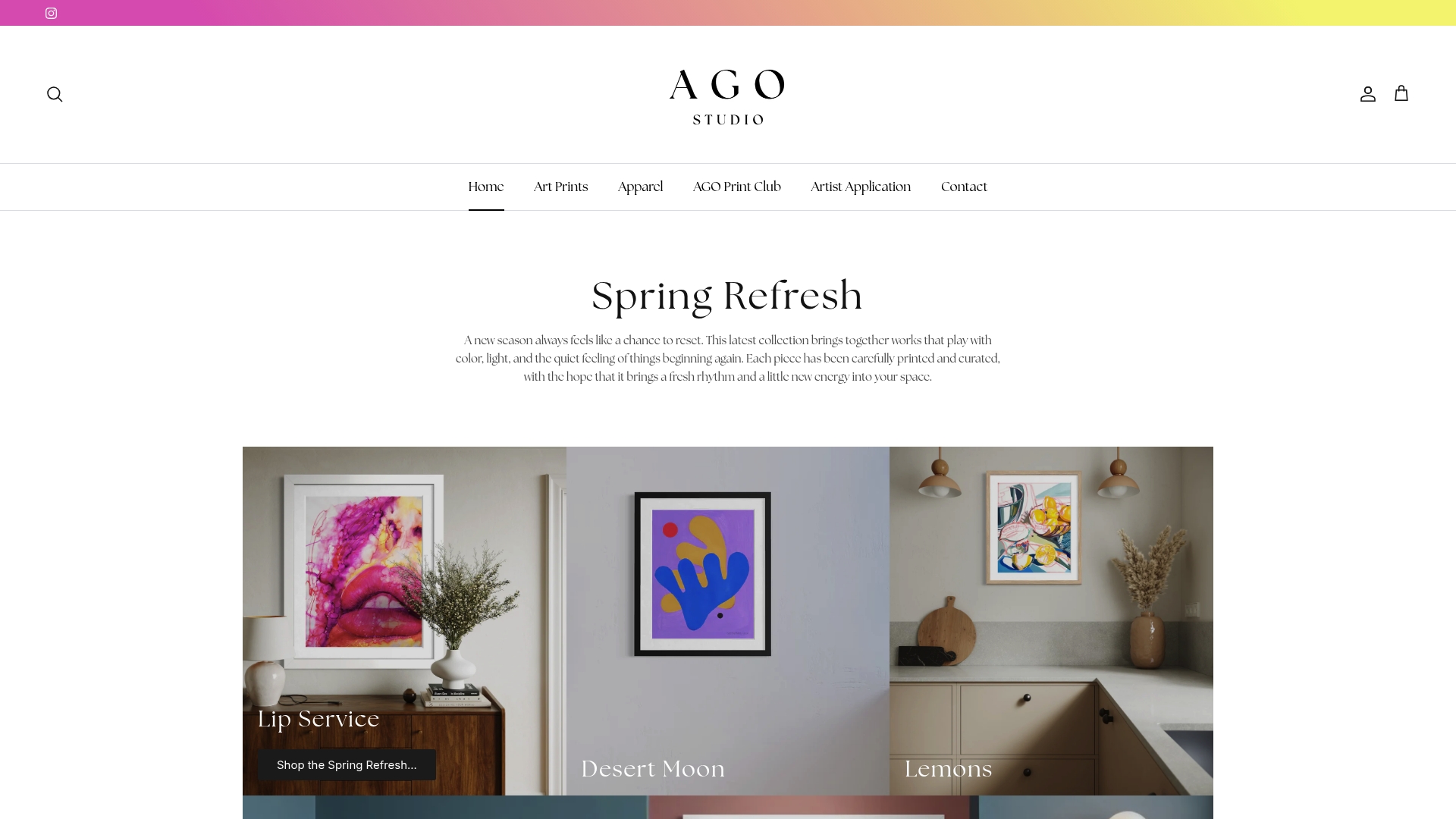
Whether you are building a multi-piece salon arrangement or looking for a single large-scale work to command an entire wall, Agostudio’s curated art prints cover both directions. The collection ranges from bold abstract landscapes to warm, intimate works that bring personal narrative into a space. For homeowners who want a rotating selection of prints to refresh their walls over time, the Agostudio Artist Print Club delivers new works on a regular basis, making it easy to evolve a gallery wall without starting from scratch.
FAQ
What is the correct height for a gallery wall in a large room?
The center of the entire gallery arrangement should sit at 57–60 inches from the floor, aligning with average eye level. This applies to the grouping as a whole, not to each individual frame.
How much wall space should a gallery wall cover?
A gallery wall arrangement should cover 60%–75% of the available wall area. Less than 60% looks sparse on a large wall; more than 75% creates visual clutter.
What spacing should I use between frames in a gallery wall?
2–3 inches between frames is the standard for a cohesive gallery wall. Gaps below 1.5 inches feel cramped, and gaps above 8 inches visually break the grouping apart.
Can a single large artwork replace a gallery wall on a big wall?
Yes. A single oversized piece covering at least two-thirds of the wall delivers strong design impact and works especially well in rooms with clean architectural lines. The minimum recommended size is 40 inches for walls wider than 6 feet.
How do I choose art colors for a large gallery wall?
Select colors based on the mood you want the room to carry. Warm tones like terracotta create intimacy, cool tones like slate promote calm, and neutral palettes keep the visual focus on the room’s furniture and architecture rather than the art itself.