

Watercolor art is defined as a painting medium in which pigments suspended in water produce translucent, luminous layers on paper, creating effects no other medium can replicate. Understanding what does watercolor art mean goes beyond the materials. It captures a philosophy of working with fluidity, accepting imperfection, and letting light breathe through every layer. Brands like Winsor & Newton, Schmincke, and M. Graham Artist Colors have built entire professional lines around this medium’s unique demands. The result is an art form that communicates emotion as directly as it communicates color.
What does watercolor art mean technically and emotionally?
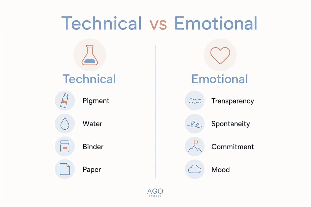
Watercolor art is built from four components: pigment, water, a binder, and paper. The binder is almost always gum arabic, a natural resin that holds pigment in suspension and controls how paint adheres to the surface. Water dilutes the mixture, and the ratio of water to pigment determines whether a wash is pale and airy or rich and saturated.
Paper is not a passive surface in watercolor. Paper texture and weight directly shape how paint flows, absorbs, and dries. A 300gsm cold-pressed sheet prevents buckling and creates gentle texture that catches pigment in ways a smooth surface never would. Choosing the wrong paper is one of the most common mistakes new artists make.
The emotional meaning of watercolor comes directly from these technical realities. Because water moves freely and dries unpredictably, every painting records the artist’s real-time decisions. Viewers sense that immediacy. A loose botanical wash by a skilled painter feels alive in a way that a tightly rendered oil portrait often does not.
Pro Tip: Add a small amount of ox gall to your water mixture. Ox gall reduces surface tension, letting paint flow into wet areas more freely and producing the soft, blooming edges that define the watercolor look.
The core materials that shape the medium
- Pigment: Professional-grade pigments from Winsor & Newton or Schmincke offer higher lightfastness, meaning colors resist fading over time.
- Gum arabic binder: Controls adhesion and gloss. More binder produces a glossier, harder film.
- Water: The primary variable. More water creates transparency; less creates intensity.
- Paper: Cold-pressed paper offers moderate texture. Hot-pressed paper is smooth and suits fine detail. Rough paper creates dramatic granulation.
- Additives: Ox gall improves flow. Masking fluid preserves white areas before painting.
How watercolor painting conveys mood and atmosphere
Watercolor communicates intimacy and immediacy in a way that heavier media rarely achieve. The medium records the artist’s moment-to-moment decisions, and that quality translates directly to the viewer. You can feel the hesitation in a pale wash or the confidence in a bold, wet stroke.
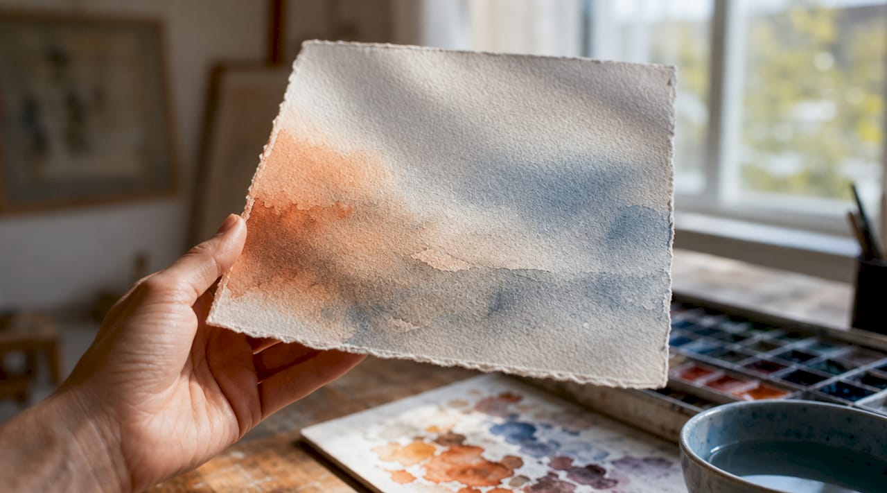
The emotional themes most associated with watercolor painting are calmness, quiet intensity, and a sense of the fleeting. Botanical and landscape studies dominate the medium for exactly this reason. Watercolor captures atmospheric light through transparent washes better than oil or acrylic can, making a misty morning or a sun-drenched garden feel genuinely present on the page.
“The most beautiful moments happen when water and color flow together. The best watercolor artists embrace unpredictability rather than resist it, finding poignant beauty in what the medium decides to do on its own.”
This philosophy is central to the watercolor art interpretation that separates skilled practitioners from beginners. Beginners fight the water. Experienced artists work with it, guiding rather than controlling.
- Calmness: Soft, wet-on-wet washes produce gradients that feel restful and organic.
- Quiet intensity: Layered glazes build depth without the visual weight of opaque paint.
- Unpredictability as beauty: Blooms, backruns, and granulation are features, not flaws.
- Nostalgia: The soft edges and muted tones of watercolor evoke memory and warmth more readily than sharp-edged digital art.
Collectors and decorators respond to this emotional register. A watercolor piece in a living room does not demand attention the way a large oil painting does. It invites you closer.
How does watercolor compare to oil and acrylic?
Watercolor differs from oil and acrylic in three fundamental ways: transparency, substrate, and environmental safety. Watercolor uses paper and is nontoxic and odorless, while oil paints require solvents, produce strong odors, and take days to dry. Acrylic dries fast but builds opacity in ways watercolor never does.
| Feature | Watercolor | Acrylic | Oil |
|---|---|---|---|
| Transparency | High (light reflects off paper) | Low to medium | Low |
| Substrate | Paper (active surface) | Canvas or board | Canvas or board |
| Drying time | Minutes | 20–60 minutes | Days to weeks |
| Toxicity | Nontoxic, odorless | Low toxicity | Solvents required |
| Correcting mistakes | Difficult | Easy (paint over) | Easy (paint over) |
| White areas | Left as paper | Painted with white | Painted with white |
The most significant practical difference is how each medium handles white. Watercolor requires planning light values from the start because you cannot paint white over a dark wash. Transparency means white is always the paper itself. That constraint forces a discipline that shapes the entire composition before a brush touches the surface.
This is also why watercolor paintings feel so considered. Every light area was protected, planned, or preserved with masking fluid. Nothing is accidental in a finished watercolor, even when the medium itself behaves spontaneously.
Pro Tip: Use a gallery wall layout to display multiple watercolor pieces together. Their shared softness creates visual harmony that a mixed-media wall rarely achieves.
Does watercolor art work well in modern home decor?
Watercolor’s ability to create soft transitions and atmospheric effects makes it one of the most versatile choices for contemporary interiors. Its natural unpredictability produces textures and moods that handcrafted aesthetics demand. No two original watercolor pieces are identical, which gives each work a uniqueness that printed reproductions cannot fully capture.
The medium suits a wide range of interior styles. Minimalist spaces benefit from a single delicate floral study, like the kind found in pieces such as Minimalist Flowers. Bolder, more eclectic rooms can carry an abstract landscape with saturated washes and dramatic wet-on-wet effects.
Watercolor is also one of the safest art materials for indoor environments. Non-toxic and odorless materials make watercolor prints and originals suitable for bedrooms, nurseries, and yoga spaces where air quality matters. For anyone creating a calming home environment, watercolor art is a natural fit.
Watercolor styles that work in different rooms
| Room | Recommended Style | Why It Works |
|---|---|---|
| Living room | Abstract landscape | Creates a focal point without visual aggression |
| Bedroom | Soft botanical | Promotes calm and rest |
| Home office | Minimalist geometric | Focuses attention without distraction |
| Nursery | Pastel florals or animals | Safe, gentle, and visually warm |
| Yoga or meditation room | Loose, atmospheric washes | Reinforces mindfulness and calm |
- Choose originals for impact. An original watercolor carries the artist’s hand in every mark. That quality reads differently in a room than a mass-produced print.
- Frame under UV glass. Watercolor pigments can fade with direct sunlight exposure. UV-protective glass preserves color for decades.
- Scale matters. A small, intimate watercolor works best in a reading nook or hallway. Large-format pieces suit open living areas.
- Color temperature guides mood. Cool blues and greens read as calm. Warm ochres and pinks feel welcoming and energetic.
Key takeaways
Watercolor art means more than a medium: it is a philosophy of working with transparency, light, and controlled spontaneity to produce paintings that carry genuine emotional weight.
| Point | Details |
|---|---|
| Transparency defines the medium | Light reflects off the paper through pigment layers, creating luminosity no opaque paint can match. |
| Planning is non-negotiable | White areas must be preserved from the start; you cannot paint light back into a dark watercolor wash. |
| Unpredictability is a feature | Blooms, backruns, and granulation are intentional qualities that skilled artists guide rather than eliminate. |
| Paper is as important as paint | A 300gsm cold-pressed sheet shapes how paint flows, absorbs, and dries, affecting the final result as much as pigment quality. |
| Watercolor suits modern interiors | Its nontoxic, odorless nature and soft aesthetic make it ideal for bedrooms, nurseries, and wellness spaces. |
Why i think watercolor’s meaning gets misunderstood
Most people treat watercolor as the beginner’s medium. It is the first paint set you get as a child, the one that washes out of clothes, the one that feels forgiving. That reputation is completely backward.
Watercolor is the least forgiving medium in painting. You cannot paint over a mistake. You cannot add white. Every decision you make is permanent the moment the wash dries. That is not a flaw in the medium. That is the entire point.
What watercolor art means, at its deepest level, is commitment. Every stroke is a declaration. The artist cannot revise or cover up. That vulnerability is exactly what viewers feel when they stand in front of a great watercolor. They are seeing the artist’s thinking in real time, preserved on paper.
I have watched new artists spend weeks fighting the water, trying to force precision out of a medium that resists it. The ones who break through are always the ones who stop resisting. They start working with the flow, placing a wash and watching where it goes, then responding to what the paint does rather than what they planned.
That shift in approach changes everything. The painting stops being a controlled execution and starts being a conversation between the artist and the medium. The emotional resonance of color in watercolor comes directly from that conversation. Viewers feel it even when they cannot name it.
My advice to any aspiring watercolor artist: stop trying to make it look like oil painting. Lean into the edges, the blooms, the unexpected granulation. That is where the meaning lives.
— DAVID
Discover watercolor art that transforms your space
Agostudio curates original watercolor artworks and high-quality prints selected for their emotional depth and authentic artistic voice. Every piece in the collection is chosen because it does something to a room: it changes the feeling of the air, starts a conversation, or gives you a reason to pause.
Whether you are drawn to loose botanical studies, bold abstract landscapes, or delicate minimalist florals, Agostudio’s art prints collection has pieces that fit modern interiors without feeling generic. For collectors who want a steady stream of new work, the Artist Print Club delivers curated prints on a regular schedule. Every piece is nontoxic, professionally printed, and ready to bring genuine warmth to any wall.
FAQ
What is the watercolor art definition?
Watercolor art is a painting medium in which pigments suspended in a water-based solution are applied to paper, producing transparent, luminous layers. The paper itself acts as the light source, reflecting through the pigment to create the medium’s signature glow.
Why does watercolor feel more emotional than other media?
Watercolor records the artist’s real-time decisions through transparent layers, giving viewers a direct sense of the artist’s presence and thought process. That immediacy creates an emotional connection that heavier, more opaque media rarely produce.
What makes watercolor painting difficult for beginners?
The primary challenge is that watercolor cannot be corrected by painting over mistakes. White areas must be planned and preserved from the start, since transparency means white is always the paper, never the paint.
How does paper choice affect watercolor painting styles?
Paper texture and weight directly control how paint flows, absorbs, and dries. A 300gsm cold-pressed sheet prevents buckling and creates moderate texture, while hot-pressed paper suits fine detail and rough paper produces dramatic granulation effects.
Is watercolor art a good choice for home decor?
Watercolor is one of the best choices for interior spaces because it is nontoxic, odorless, and produces soft, atmospheric effects that suit a wide range of modern aesthetics, from minimalist to eclectic.